Top 10 Amazon Product Image Mistakes to Avoid
Apr 2, 2025
Joel Turcotte Gaucher
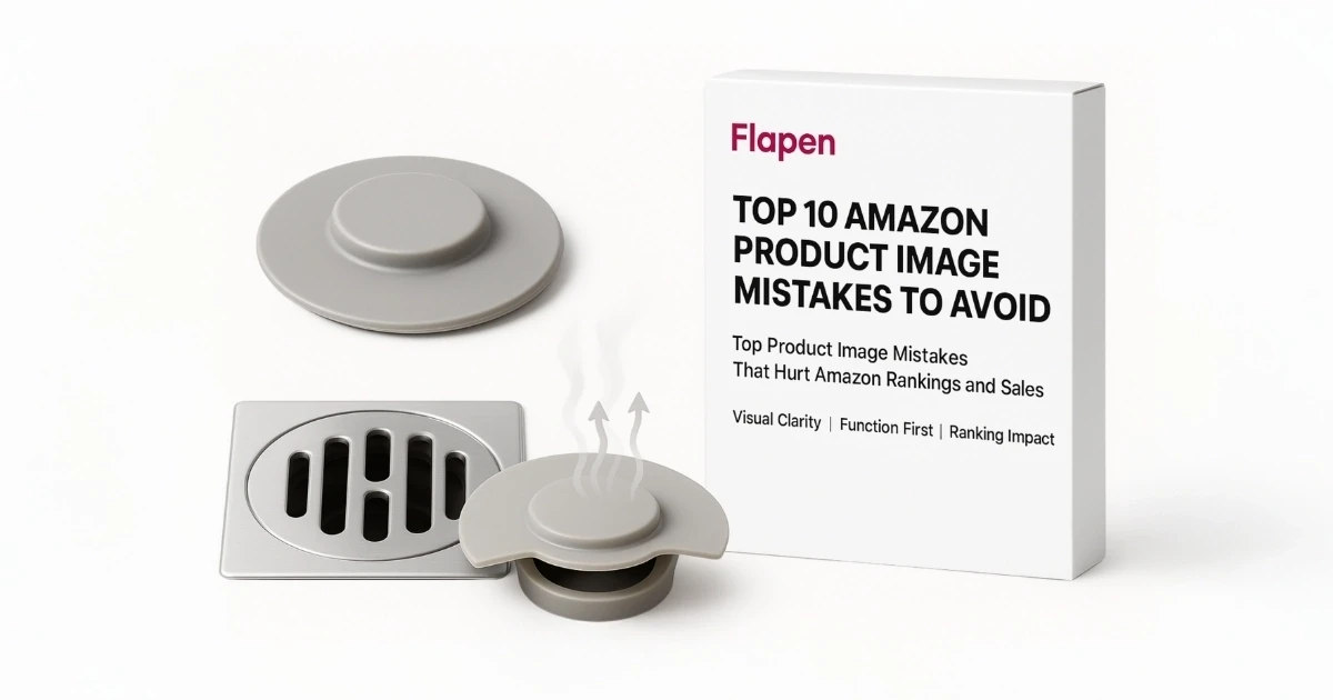
Top 10 Amazon Product Image Mistakes to Avoid
On Amazon, buyers make snap decisions.
They don’t read. They scroll. And if your images don’t instantly build trust and answer key questions, they move on.
Your product visuals are the difference between “Add to Cart” and “back to search.”
At Flapen, we’ve launched over 100 brands, and image optimization is always a priority. Strong visuals increase conversions. Weak visuals hurt performance—even if the product is great.
Here are the 10 most common image mistakes sellers make—and how to fix them quickly.
1. Low-Quality or Blurry Images
This is the fastest way to lose trust.
Low-resolution or pixelated images:
Look unprofessional
Block Amazon’s zoom feature
Reduce buyer confidence
🔧 Fix: Use high-resolution images (at least 1600×1600px). JPEG format is best for quality and speed.
2. Breaking Amazon’s Main Image Rules
Amazon’s requirements are strict—and violations can get your listing suppressed.
Common violations:
Logos, badges, or text in the main image
Lifestyle backgrounds instead of pure white
Showing multiple products when you’re selling one
Poor white background (must be RGB 255,255,255)
🔧 Fix: Keep your main image clean, clear, and compliant. It must show only the product, on a white background, filling at least 85% of the frame.
3. Only Uploading One Image
One image isn’t enough. Amazon allows 7–9 image slots for a reason.
Shoppers need to see:
Multiple angles
Size comparisons
Features explained
Real-life usage
🔧 Fix: Use all your image slots. A complete image set converts better—without changing your product or price.
4. No Lifestyle or Context Images
Buyers want to see how the product fits into their life.
Product-on-white is necessary, but not enough.
🔧 Fix: Add at least one lifestyle image showing the product in use by a person or in a real-world setting.
Example: Show a yoga mat being used in a home gym—not just rolled out in a studio.
5. No Infographics or Feature Callouts
If your product has standout features, they need to be shown—not hidden in bullet points.
🔧 Fix: Use 1–2 infographic images to highlight:
Key features
Material quality
What’s included
Dimensions
Keep it simple and mobile-friendly. Use icons and large text. Don’t overload with fine print.
6. Inconsistent Visual Style
A messy, mismatched image set can make your brand look cheap or disorganized.
Common mistakes:
Different lighting setups
Different fonts or colors in each image
Off-brand props or models
🔧 Fix: Keep a consistent:
Color scheme
Font and layout style
Photo tone and background
Your images should feel like they’re from one brand, not five suppliers.
7. Poor Lighting or Shadows
Bad lighting makes good products look bad. It hides detail, flattens shape, and creates confusion.
🔧 Fix: Use soft, balanced lighting. Avoid harsh shadows or yellow tones.
Natural light or a simple studio setup works well for most categories.
At Flapen, we shoot with brand-focused lighting in our Dubai studio—because even small lighting tweaks impact conversions.
8. Over-Edited or Misleading Images
Don’t promise more than you deliver.
Adding extra items that aren’t included or exaggerating product features leads to:
Returns
Bad reviews
Trust loss
🔧 Fix: Show exactly what the customer receives. No added accessories unless they’re in the box. No filters, flashy effects, or fake glow-ups.
Honest visuals build long-term trust.
9. No Size or Scale Reference
A top reason for negative reviews?
“Smaller than expected.”
If shoppers can’t judge the size, they hesitate—or worse, return it.
🔧 Fix: Add an image that clearly shows:
The product in hand
Next to a common object
With a measuring graphic overlay
This simple image reduces confusion and returns.
10. No Testing or Performance Tracking
Even “good” images might not perform if they don’t match what buyers expect.
If you’ve never tested your visuals, you’re guessing.
🔧 Fix: Use Amazon Experiments to A/B test your main image. Or track click-through and conversion rates in Campaign Manager to measure performance.
At Flapen, we test image variations regularly—because what works in one niche may flop in another.
📌 Quick Recap: Fix These, Fast
Mistake | What to Do |
|---|---|
Low-resolution or blurry images | Use 1600×1600px+ JPEGs |
Breaking Amazon rules | Follow white background + no extras in main image |
Only one image uploaded | Use all 7–9 image slots |
No lifestyle shots | Add real-life, in-use photos |
No infographics | Highlight key features with icons + short text |
Inconsistent style | Keep fonts, lighting, and colors on-brand |
Bad lighting | Use soft, even light to show details |
Misleading edits | Only show what’s included |
No size reference | Add in-hand or dimension visuals |
No testing | Run A/B tests or monitor CTR + CVR weekly |
Final Thoughts
Your product images are the fastest way to improve listing performance—often without changing your product, pricing, or reviews.
Avoiding these 10 common mistakes can:
Improve your click-through rate
Build trust faster
Lower return rates
Increase conversions
Support better ad performance
At Flapen, we specialize in Amazon-optimized visuals. Our creative team produces compliant, conversion-focused images that don’t just meet Amazon’s requirements—they help you win the sale.
Related Articles
Featured Articles
Latest Articles